The Art of Choosing Fonts for Book Covers
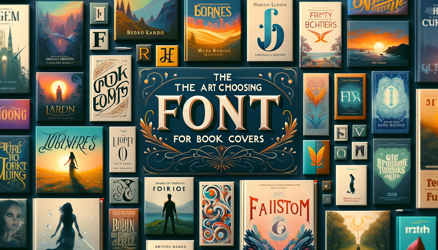
In the world of publishing, a book cover is more than just a protective sleeve; it’s a crucial marketing tool. The font on a book cover plays a pivotal role in conveying the book’s essence and attracting potential readers. This article delves into the art of choosing the perfect font for book covers, a decision that blends aesthetic appeal with narrative communication.
Understanding Genre and Audience
The first step in selecting a font is understanding the book’s genre and target audience. A thriller might require bold, imposing lettering to convey suspense, whereas a romance novel might lean towards elegant, flowing scripts. Fonts carry emotional undertones, so choosing a typeface that aligns with the book’s mood is essential.
Legibility and Size
Legibility is key. The book title should be readable at various sizes, especially for online thumbnails. Fonts that are too decorative can become illegible, especially when scaled down. It’s crucial to balance artistic flair with functionality.
Consistency with Theme and Content
The font should reflect the book’s theme and content. For a historical novel, a font that evokes a sense of the past can be very effective. For science fiction, a modern or futuristic font could better suit the book’s theme. The typeface should be a visual extension of the story.
Creating Emotional Impact
Fonts have the power to evoke emotions. A well-chosen font can intrigue, delight, or even unsettle a reader at first glance. The goal is to create an emotional response that prompts a potential reader to explore further.
Contrasting and Complementary Fonts
Sometimes, using two contrasting fonts can create a dynamic and visually interesting cover. However, it’s important to ensure that the fonts complement each other and don’t clash. A balance between contrast and harmony is key.
Trends vs. Timelessness
While it’s tempting to follow current font trends, it’s important to consider longevity. A timeless font can ensure the book remains visually appealing for years to come. However, trending fonts can make a book appear current and relevant.
Custom Typography
For a truly unique cover, custom typography can be a game-changer. Custom fonts or hand-lettered designs can give a book a one-of-a-kind look, making it stand out in a crowded marketplace.
Testing and Feedback
Before finalizing the font, it’s helpful to test it in various formats and get feedback from different sources. Seeing how the font looks in print, online, and in different lighting can prevent unforeseen issues.
Conclusion Choosing the right font for a book cover is a blend of art and strategy. It requires understanding the book’s essence, audience expectations, and the subtleties of typographic communication. The perfect font choice can capture the imagination of potential readers and make a book leap off the shelf.


