Typography in Film and Television: Setting the Scene with Fonts
Typography in film and television isn’t just about conveying information; it’s an art form that sets the tone, era, and mood of the narrative. From the opening titles to the closing credits and every subtitle in between, fonts are an integral part of visual storytelling. This article explores how typography is used in film and television to create atmosphere, signify character, and engage audiences.
Opening Titles: The First Impression
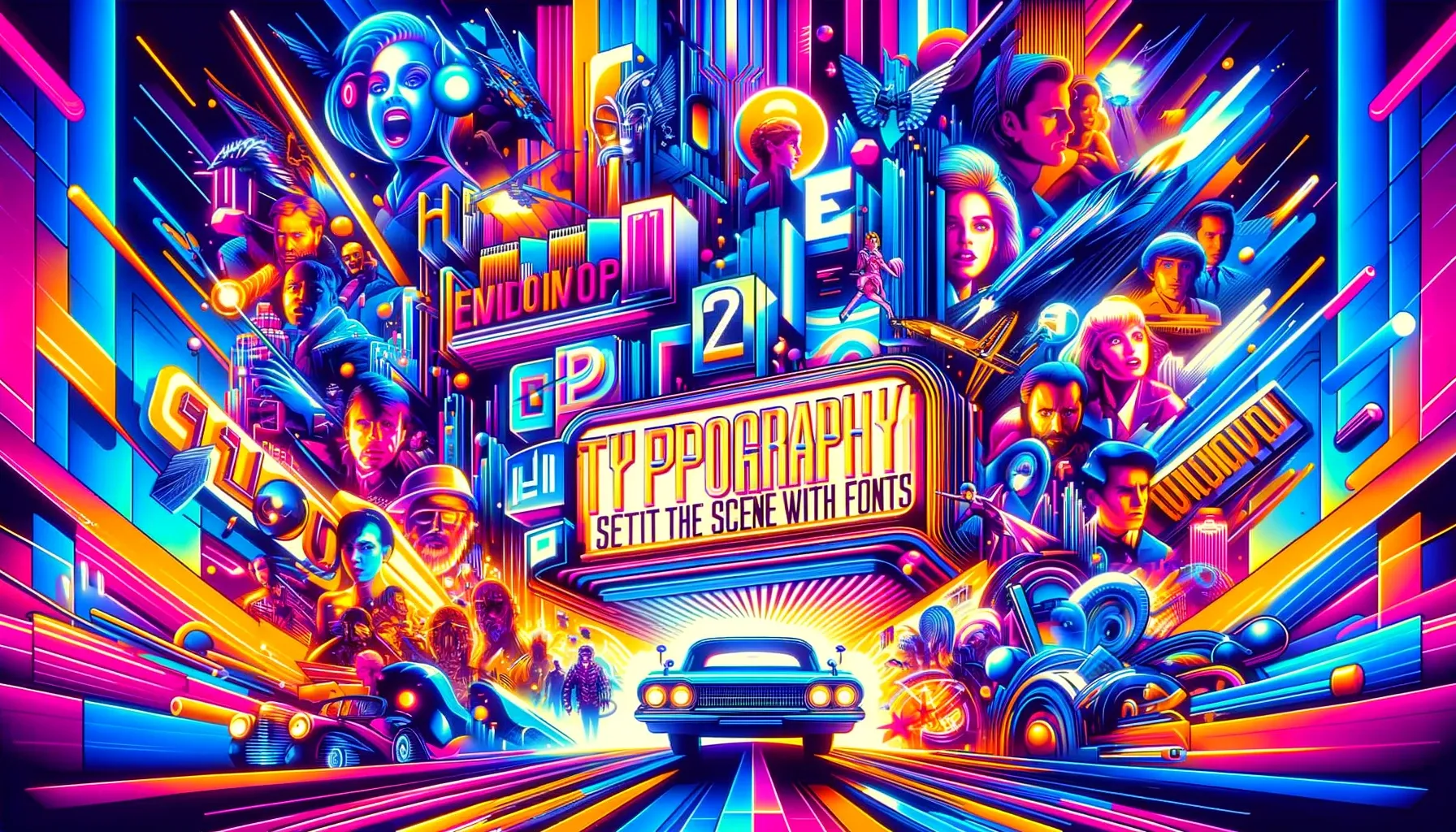
The opening titles of a film or TV show are often the viewer’s first encounter with the story’s visual style. The choice of font here can make a powerful statement. For instance, the elegant script of “The Godfather” immediately suggests a classic, high-stakes drama, while the digital, monospaced font of “Black Mirror” sets the stage for tech-centric, futuristic narratives.
Conveying Time and Place
Typography is a subtle yet effective tool for anchoring a story in a specific time and place. Period dramas might employ fonts that reflect the era, such as Art Deco styles for the 1920s or groovy scripts for the 1970s. Similarly, the use of neon, futuristic fonts can transport viewers to a sci-fi universe.
Character and Tone
Fonts are also used to mirror a character’s personality or the tone of the narrative. Bold, stark fonts might be used for a no-nonsense protagonist, while whimsical, handwritten fonts could signify a quirky, lighthearted tale. The right font can serve as a visual shorthand for character traits and narrative style.
Subtitles and On-screen Text
Typography is not only for titles but also for any text appearing on screen, including subtitles and location indicators. The legibility and style of these fonts are crucial as they provide essential information without distracting from the visual narrative.
Impact of Typography in Marketing
The typography used in film and TV marketing materials, such as posters and trailers, is just as critical. It’s the visual hook that captures potential viewers’ attention and communicates the essence of the film or show. The font used in a movie poster can make the difference between a viewer stopping to take notice or walking on by. Read more about The Psychology of Fonts in Marketing
Challenges and Innovations
Typography in film and TV faces unique challenges, such as readability on various screens and the seamless blending of text with moving images. Innovations in this field are continually pushing the boundaries, with motion typography and interactive fonts leading the way.
Conclusion In film and television, typography is a powerful tool that filmmakers and designers wield with precision and creativity. It’s more than just font choice; it’s about setting the scene, building character, and crafting an immersive narrative experience. As technology and viewer preferences evolve, so too will the art of typography in visual storytelling.